Kagyu Samye Dzong Cardiff
Modernising the online presence for a Tibetan Buddhism Centre with an ancient lineage
Introduction
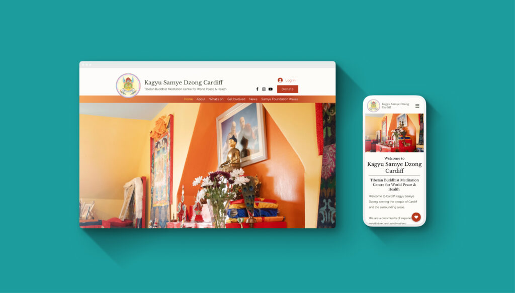
Kagyu Samye Dzong Cardiff is a Tibetan Buddhist Centre in my city, it has an ancient lineage but an approachable appearance, an oasis for people who are seeking inner peace in a healthy community and a safe environment.
When I started volunteering there, I found that although the centre has a lot to offer, people don’t always know that it’s there, so I took the initiative to help revamping the website, which leads to so much more.
Problem statement
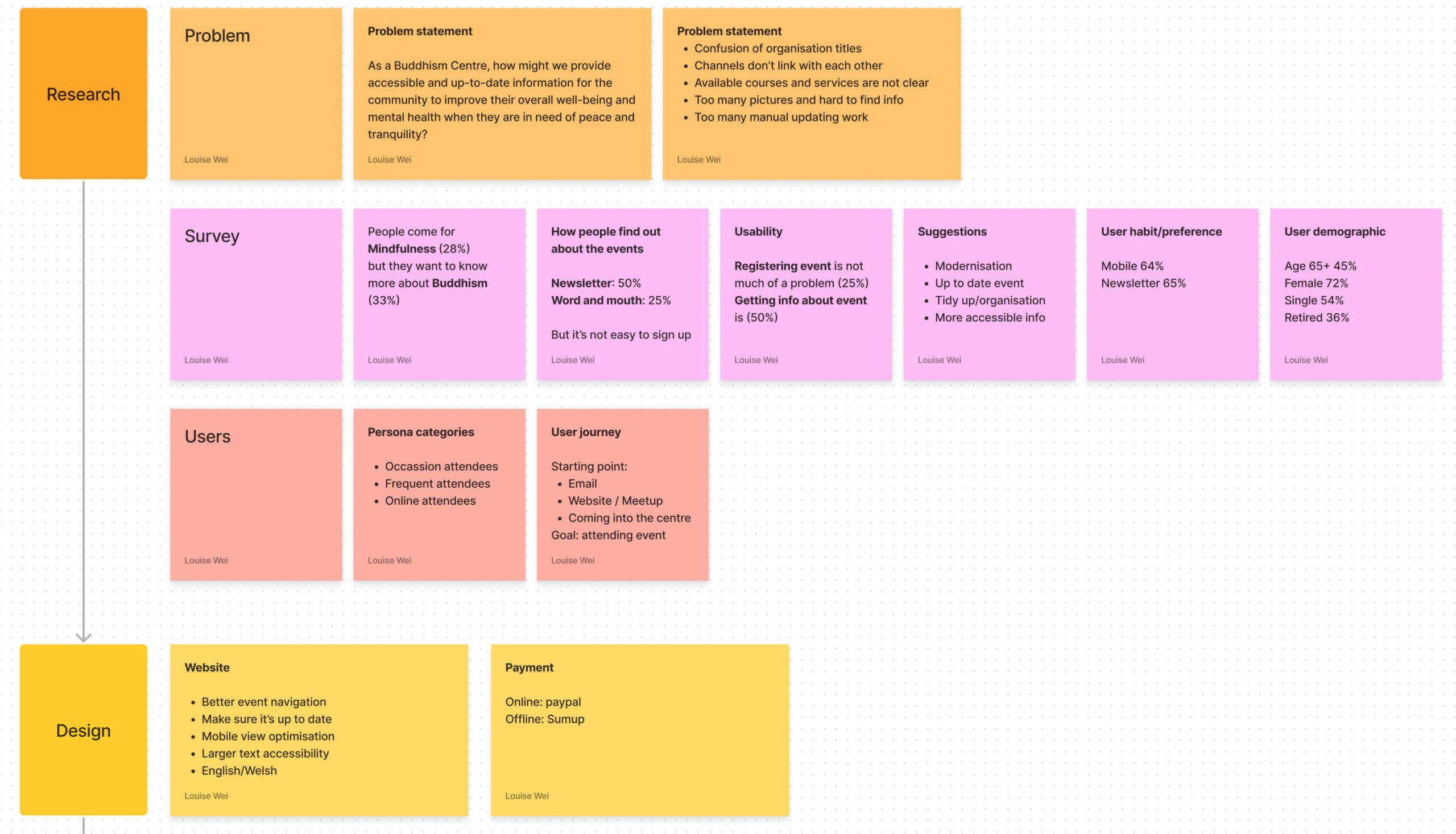
As a Buddhism Centre, how might we provide accessible and up-to-date information for the community to improve their overall well-being and mental health when they are in need of peace and tranquility?
Solution
Research & Process
As we embark on this new project, a significant amount of time and effort was put into the initial research and planning, working towards ensuring its success.
Through volunteering, I actively interviewed stakeholders involved to understand their needs for the website, as well as conducting a survey and meeting with other centres to gain a deeper understanding of their experiences, recommendations, guidelines, and best practices.
Through these efforts, we hope to gain valuable insights that will inform our approach to the project, allowing us to create an information architecture that is both effective and efficient to provide informative service to the community.
Additionally, I conducted research on the best-suited hosting options that will enable us to maintain the platform in a financially viable manner in the long run.
Information Architecture
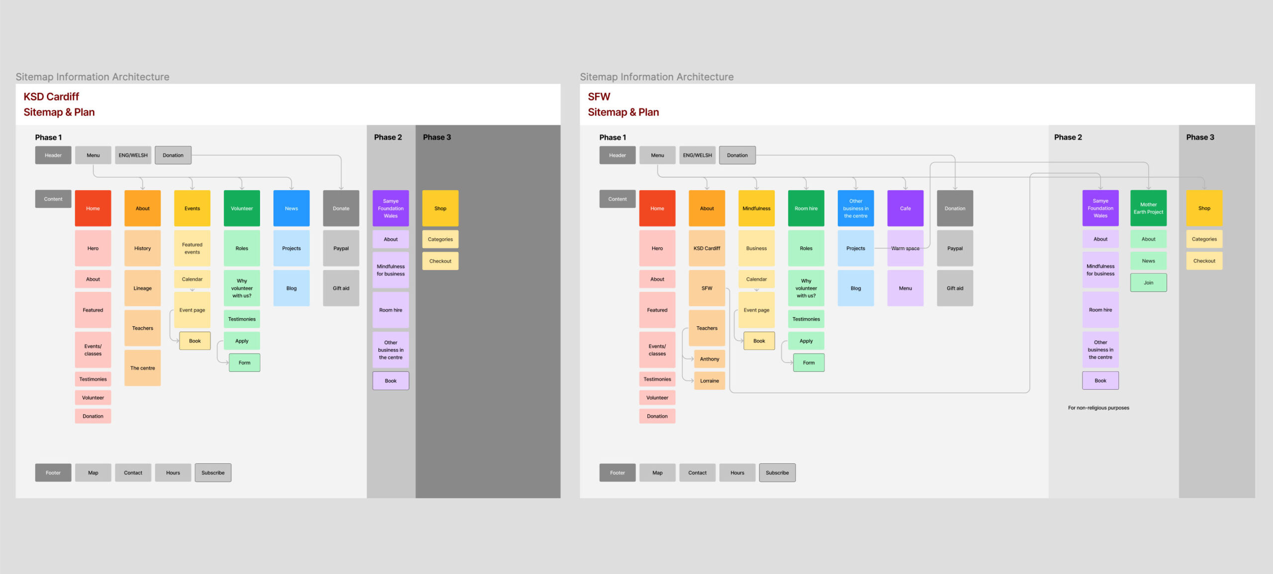
KSD has two organisation, one is Samye Foundation Wales (SFW), the two have distinct functions and provide related but somewhat different services.
So in the process of planning the future for KSD website cannot go without thinking about SFW, so the plan keeps rolling and becomes more exciting.
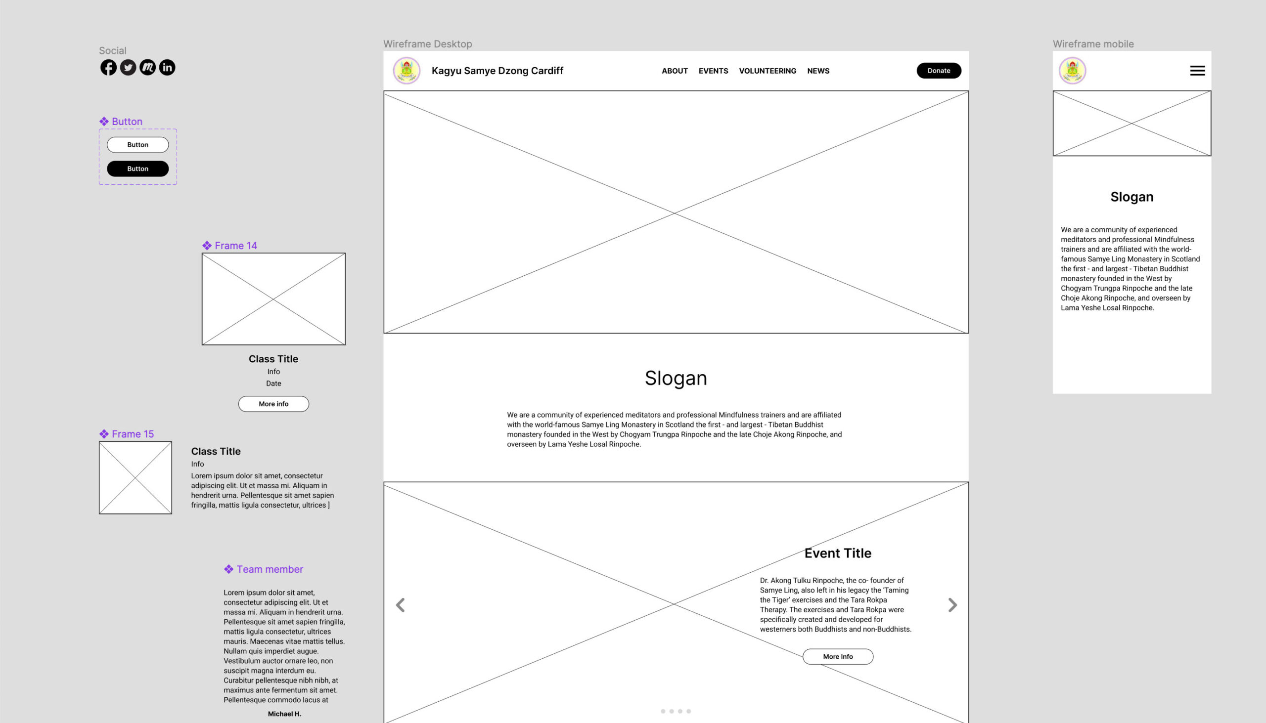
Wireframing
Before we decided to go with Wix, I designed the wireframe with Figma to show the stakeholders the visualised plan, and that helps with the decision making to move forward with more planning down the road.
Prototyping & Testing
After been given the go-ahead, I spent a few weeks on Wix and finished the prototype and start testing with the help of several fellow volunteers, to our surprise, through the power of google, there are already people using our website and start registering and RSVPing events, it’s a great joy to see it become useful so quickly.
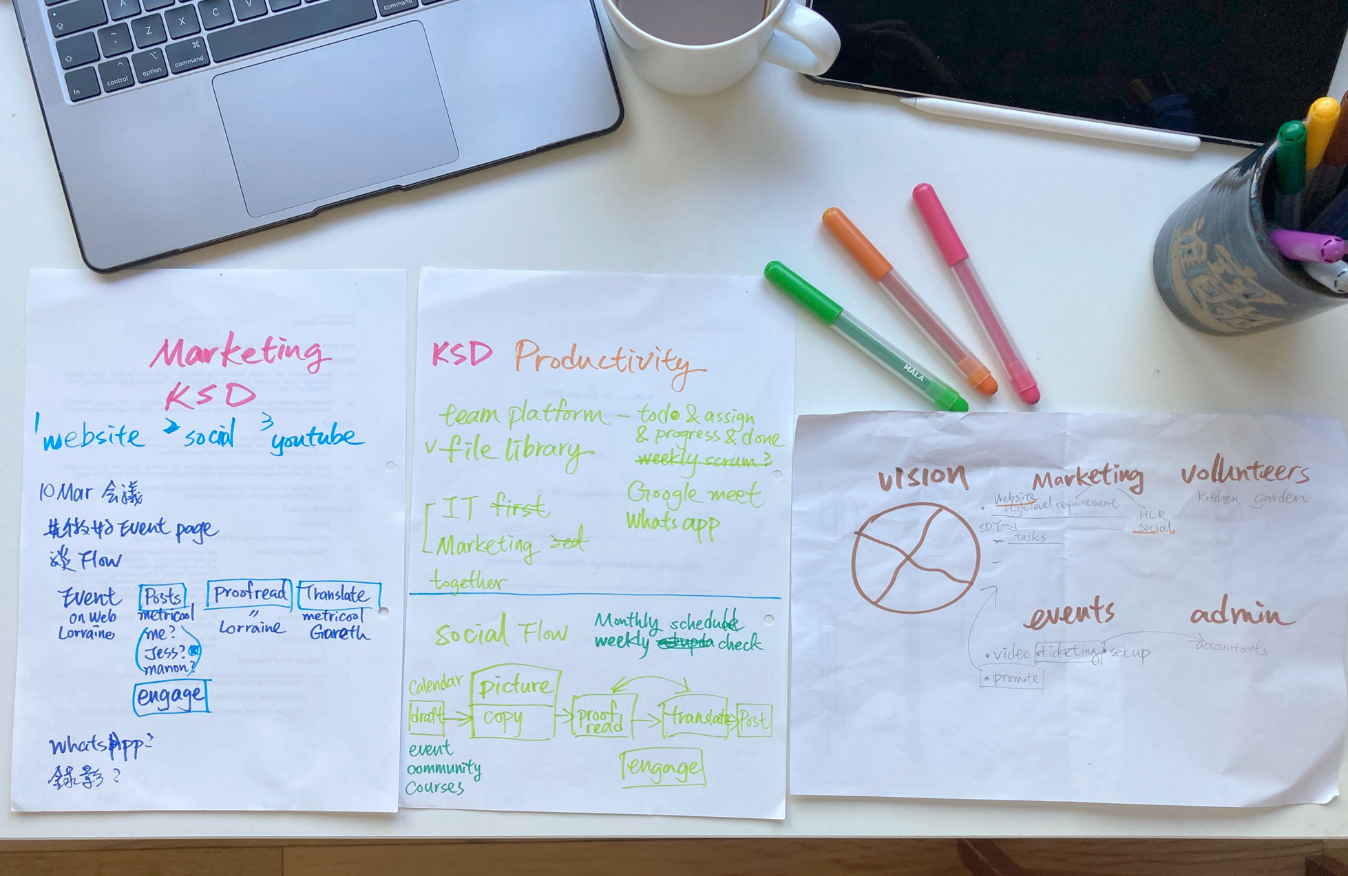
Thinking about the users and the team
The handwritten notes don’t always make sense but eventually helped with a more complete flow done on the computer.

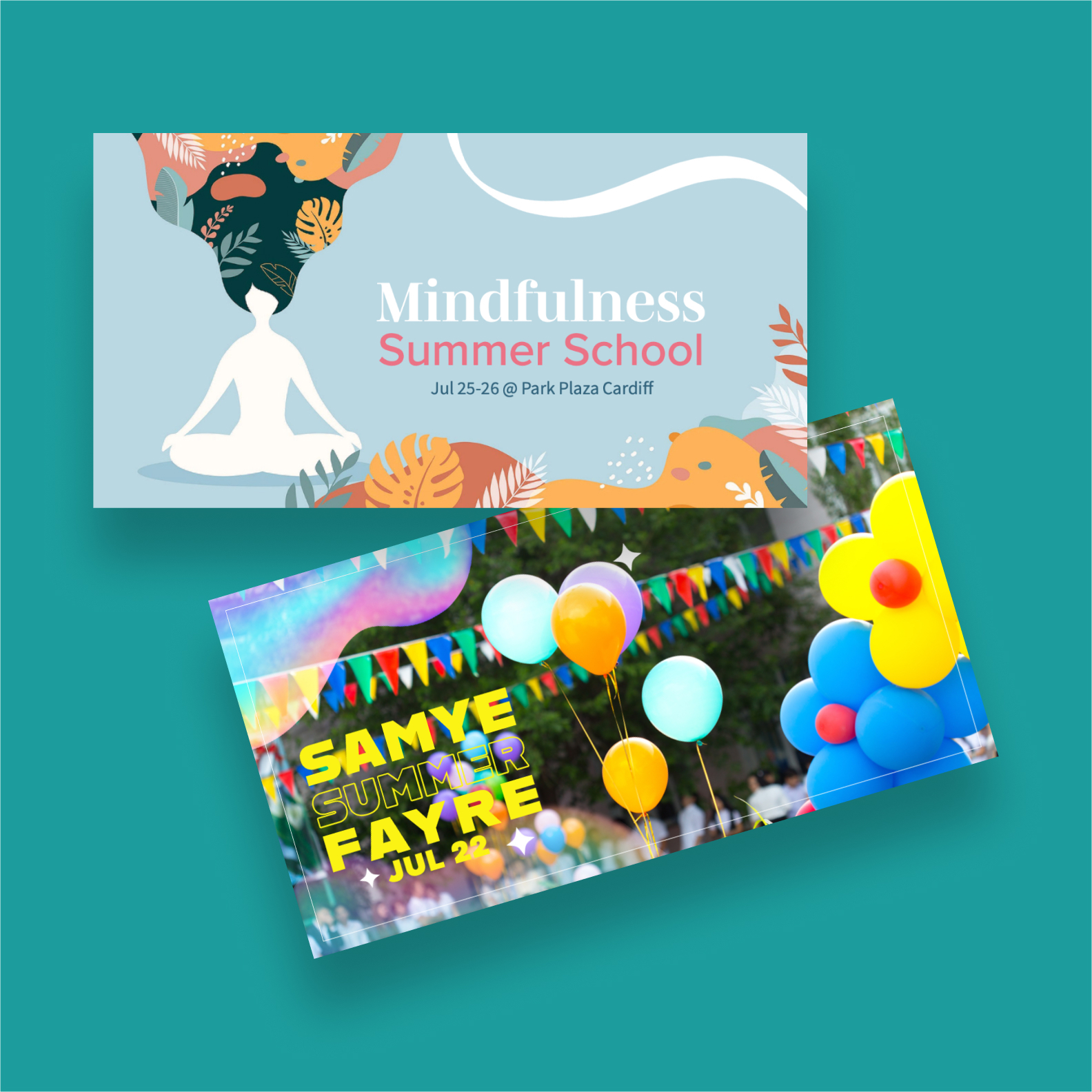
Marketing & Graphic Design
Since the website is up and running, I facilitated interested volunteers to form a Marketing Team for the centre. Through trial and error, we found the most compatible tools to help us with productivity, and through encouraging the team to be more self-managing and putting the helpful resources in place, the team has become more productive and agile, we start to look forward to spending the volunteering hours together.
I also step in to exercise my Graphic design skills to make social banners for the upcoming events, hope to spark imaginations for what the centre has to offer.
Results
The centre’s need to reach its audience and be more transparent in providing information has been fulfilled by having a modern and up-to-date website in place,
The result has been proven successful through increased event attendance, user engagement, and donations.
The project is now in the post-project phase, we aim to maintain the website and seek rooms for improvement continuously in the future.
To me, it’s great to see that people are getting the right information and help out wherever I can.